Most hiring dashboards built by small teams measure activity, not outcomes. Total applications, social shares, time on the careers page — these all rise when the team works harder and tell you nothing about whether hiring is improving. This post is the six numbers that drive decisions, the four to delete, and the weekly review that catches breakage early.
Which metrics actually matter at small scale?
Six. Each one answers a specific question the team needs to answer, and each one can be computed from data the ATS already collects.
| Metric | Question it answers | Review frequency |
|---|---|---|
| Time-to-hire | How long does our process take? | Weekly |
| Application → screen rate | Is the JD pulling the right applicants? | Weekly |
| Screen → offer rate | Are we identifying the right shortlist? | Monthly |
| Offer-acceptance rate | Are we closing strong candidates? | Monthly |
| Cost-per-hire | Is hiring at a sustainable budget? | Quarterly |
| Source-of-hire mix | Where should we spend next quarter? | Quarterly |
The pattern: ratios, not counts. The ratios change when the underlying process changes; the counts change when the team gets busier. The first set is information; the second is noise dressed up as information.
The benchmark numbers, where they exist, come from sources like SHRM's Human Capital Benchmarking Report, LinkedIn Talent Solutions' Global Talent Trends, and the U.S. Bureau of Labor Statistics on employment turnover. Most published medians put time-to-hire in the 4-to-6-week range for non-executive roles in the U.S. and Europe, and cost-per-hire in the low-thousands for small businesses, though the variance is wide enough that the team's own baseline matters more than any industry benchmark.
TIP — Your own baseline beats any benchmark Industry benchmarks are useful for board reporting and useless for operational decisions. The number that tells you whether your hiring is healthy is your own metric from three months ago compared to this month. Track the delta; the absolute number is secondary.
Why is time-to-hire the metric that moves first when things break?
Because every other metric is downstream of process speed. A stalled candidate is a missed offer, a delayed offer is a lost candidate to a competitor, and a competitor's hire is your re-opened role. The leading indicator that the process is breaking is almost always time-to-hire rising — not application count falling.
The components of time-to-hire, in order of how often they cause regressions:
- Interview-feedback latency. Interviewers not submitting feedback within the 48-hour SLA. This is the most common regression and the cheapest to fix — see how to build an interview scorecard your team will actually use for the SLA architecture.
- Scheduling friction. Too many people in the loop, no scheduling tool, calendars not shared. Cheap to fix; commonly under-prioritised.
- Decision-meeting delay. The decision meeting keeps getting pushed because not all feedback is in (see #1).
- Offer-letter back-and-forth. Salary range negotiations that should have happened pre-offer, equity calculations done from scratch each time, contract templates not standardised.
When time-to-hire rises, one of these four is almost always the cause. The weekly review is what catches it before two weeks of slippage become four weeks.
What does the application-to-screen rate tell you?
It tells you whether the JD is doing its job. A healthy application-to-screen rate (the fraction of applicants who advance past the first review) varies by role and channel, but most small teams converge on a healthy range somewhere between 10 and 30 percent for inbound applications. Below that, the JD is attracting the wrong people or the screening bar is too high relative to the candidate pool. Above that, the JD is too narrow and you are missing applicants.
This is the metric the team can move fastest on. Edit the JD, watch the next week of applications, observe the rate. The LinkedIn Economic Graph team has published recurring research showing that job-posting language has a measurable effect on both apply rate and quality of applicant; the lever is real and it works at small scale.
The screen-to-offer rate, by contrast, moves more slowly and is more about interview design than JD design — see how to build an interview scorecard for the architecture.
Why is cost-per-hire complicated at small scale?
Because fixed costs distort it. If your team has spent $200 a year on a job board and $120 a year on an ATS, your first hire's "cost-per-hire" is $320 — and your fifth hire's cost-per-hire is $64. The math is technically correct and operationally meaningless.
Two fixes. First, wait. Cost-per-hire becomes interpretable around hire five, when fixed costs amortise across enough denominators to stop distorting the picture. Second, track two versions: out-of-pocket only (for benchmarking against industry numbers) and out-of-pocket plus founder/recruiter time at a notional rate (for understanding what hiring actually costs the business).
According to SHRM's recurring Human Capital Benchmarking, median cost-per-hire across U.S. companies sits near $4,700, with significant variance by company size, industry, and seniority of the role. A small-team out-of-pocket cost-per-hire well below that — often $200 to $800 — is normal and expected. The time-loaded number tells the more honest story.
"The most useful version of cost-per-hire is the one that tells you which channel you're overpaying for. Source-of-hire mix divided into cost-by-source is where actual sourcing decisions get made."
— Collin, Founder, RecruitIn
What are the 4 vanity metrics to drop?
These four feel meaningful, correlate weakly with hire quality, and absorb dashboard space that would be better used for the six above.
| Vanity metric | Why it fails as a decision input |
|---|---|
| Total applications | Counts effort, not outcomes. A higher number rarely means better hires. |
| Social shares on JDs | Measures the social-media half of brand work, not the hiring half. |
| Average time spent reading a JD | Highly correlated with "the JD is too long," which is a problem, not a goal. |
| "Pipeline value" or imputed revenue per candidate | Spreadsheet theatre. No small team has the data to compute this credibly. |
The test for whether a metric belongs on the dashboard: would you change a hiring decision tomorrow based on it moving up or down? If the answer is no, the metric belongs in a quarterly retrospective at most, not on a weekly dashboard.
The harder version of this rule, applied to your existing dashboard: pick the metric you spend the most time looking at, and ask whether you have ever changed a decision because of it. Be honest. Most teams find that one or two of their tracked metrics are habit, not information.
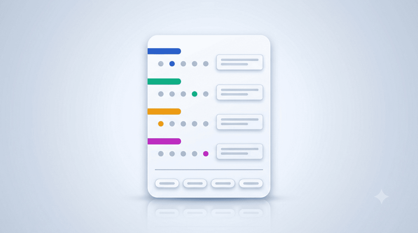
What does the simplest working dashboard look like?
One screen. Six numbers. Updated weekly. No charts unless the chart adds information the number cannot.
- Open roles — how many active jobs are live
- Total applicants this week — flow indicator, not a target
- Average application-to-interview rate — across all open roles
- Average time-to-hire — for roles that closed this quarter
- Offer-acceptance rate — for offers extended this quarter
- Source-of-hire mix — for hires this quarter, broken into 3-5 channels
A team running this dashboard catches breakage within a week, makes sourcing decisions with evidence, and reports to its board with numbers that mean something. A team running a 20-metric dashboard misses the same breakage and feels busier doing it.
Closing thought
Hiring is a process whose outcomes show up months after the inputs. That delay is what makes vanity metrics dangerous — they reward the team for activity that has not yet been judged by outcomes. The six metrics above are the ones that close the feedback loop fastest. The four to drop are the ones that obscure it.
To set up the dashboard against a working pipeline, create a free RecruitIn workspace — every metric above is computable from the data the ATS already collects. To understand why the JD is the leverage point for the top of the funnel, read how to write a job description with AI. To understand why the scorecard is the leverage point for the middle, read how to build an interview scorecard your team will actually use. Pricing details on the pricing page.